There's Tutti Frutti as my main competitor, therefore by doing research on their product, design, color and so on will help me in my logo design. Tutti Frutti's logo comes with three different fruits together with the name- Tutti Frutti and bottom with "frozen yogurt".
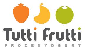
It comes with three different- orange, yellow and green.
Referencing
Bryan, (2011). Retrieved from http://sunrisepos.com/industry-products/restaurant-pos-systems/tutti-frutti-logo-2
Concept and Ideation
In my mind comes with berries, first of all i have my own so call nick name- sherrberries. Since frozen yogurt are more likely comes with strawberries, blueberries, and here I name my logo as BERRIES LAND. Which the main yogurt product would be in berries flavor.
Sketches
This is the first sketch that i did,

The artwork came randomly, no meaning, simply a logo. It is because i use to draw without planning what to draw and end up with something unexpected. Anyhow i still did this in illustrator as i thought im going to use this as my logo. :

I uses reflect effect for the "Land" word is to attracts people attention and with some creativity.
This are my other sketches so i will come out with more ideas and i have more to choose.


In illustrator form :

Crafting
1) Type logo name

2) Type Berries & Land in a separate text.

3) Select "Land", put into reflect effect.


5) Then each letter is in individual now.

6) Enlarge the "L" without holding shift key so it will look longer.

7) Go to the symbols panel, select flower. Then select symbol sprayer tool on the left bar. Start spraying.

8) Spray more.


11) Go to control panel on top and select brush definition.

12) Copy and paste the "L" and change the fill color.


14) Place the remaining "L" at the pink "L". So it will combine the two colors.

15) Select the flower and put in round corners effect.


18) Last but not least, select flower and put in roughen effect.

19) And place back the flower near the words.

Final Artwork

This is my final artwork for logo design. I choose Berries Land is because i personally like berries a lot and as well as berries is the significant fruits for yogurt.
Flowers are in the logo makes people feel warm and fresh, i believe. Flowers brings lively feeling too.
Whereas the letter "L" is in two colors, because i want it to be unisex. Even though there's not fact saying that female must be pink or red and male has to be blue, however people tend to perceive it that way. The same sense, i combined this two colors is to create the feeling where whoever they are, they are always welcome to the shop. In the logo, i try to achieve balance through letters by using reflection for "land".
No comments:
Post a Comment