Thursday 29 November 2012

Poster Design


Research:
This yogurt poster that i found on the Internet, where i find it interesting of its background color. Therefore in my poster i decided to do something similar to the background. 

Besides, I've also find this poster on the Internet, 
and i think that it is really cute, with cartoonish picture. And so, i've decided to put in eyes image in my poster. 

Referencing:

Bryant, (2010). Retrieved from http://www.google.com.my/imgres?q=yogurt+posters&um=1&hl=en&sa=N&tbo=d&biw=1163&bih=677&tbm=isch&tbnid=ZARNczZVw7zdnM:&imgrefurl=http://bryantcreates.com/&docid=dB83luIJJm6G7M&imgurl=http://bryantcreates.com/wp-content/uploads/2010/02/yog_poster_preview.jpg&w=565&h=350&ei=-je4UMD7OsvjrAfHxYG4CA&zoom=1&iact=hc&dur=471&sig=114545935789519472344&page=1&tbnh=147&tbnw=259&start=0&ndsp=32&ved=1t:429,r:0,s:0,i:83&tx=174&ty=70&vpx=4&vpy=139&hovh=177&hovw=285

Anonymous. Retrieved from http://www.zazzle.com/bright_eye_heart_i_love_frozen_yogurt_posters-228967671526849650

Sketching

These is my sketching.


                                                                    Rough Sketching


Last sketch before I start it on illustrator


Steps on illustrator

1 Starting with the outline of an eye. and a copy of logo.

2 More details on eyes.


3 Color the eyes based on the berries color of the logo.


4 Create a new blank file, and put two colors and combine them for the background.


5 Copy paste the eyes that already done, and place the logo at upper-center. Add on mouth and frame.


6 Insert words "Frozen Yogurt" above the eyes.


7 Add effects on the word.


8 Lastly, create effect on the logo itself.


Final Design 


From the research i did on the Internet, it grabs my attention about the combine color of background, therefore i've did the same concept where i combined two different color for the background. 

I place the logo in the upper-center is because by visualizing the poster, viewer tend to get the attention from the eyes first and goes up to the logo. So they will eventually know my logo and the "Frozen Yogurt"words tell what is the product would be. 
I believe that nowadays, there is many way or techniques to create a effective poster or unforgettable poster. And i hope my poster will attracts people from the eyes at the first glance. 


Monday 29 October 2012

Research


Crafting

Step 1: Place the logo in the middle of the cup.

Step 2: Add 3 blue lines, one on top of the logo, the other two at the bottom of the logo.


Step 3: Form green lines.


Step 4: Adjust the lines in the way you like. Add more lines if you want to.


Final Artwork 


I've decided to use lines as my background for cup packaging. Lines to me is simple and never out of trend. Chosen lines in green is to balance back the leaves on the logo (without colour), where the red lines represents berries colour. By using lines i formed some pattern and make it as my based for the cup packaging. I am here to achieve "Simple". 

Tuesday 9 October 2012

Berries Land Logo Design Final(redo)!


Research

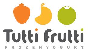
There's Tutti Frutti as my main competitor, therefore by doing research on their product, design, color and so on will help me in my logo design. Tutti Frutti's logo comes with three different fruits together with the name- Tutti Frutti and bottom with "frozen yogurt".


It comes with three different- orange, yellow and green.

Referencing 

Bryan, (2011). Retrieved from http://sunrisepos.com/industry-products/restaurant-pos-systems/tutti-frutti-logo-2

Concept and Ideation 

In my mind comes with berries, first of all i have my own so call nick name- sherrberries. Since frozen yogurt are more likely comes with strawberries, blueberries, and here I name my logo as BERRIES LAND. Which the main yogurt product would be in berries flavor.

ketches

This is the first sketch that i did,


The artwork came randomly, no meaning, simply a logo. It is because i use to draw without planning what to draw and end up with something unexpected. Anyhow i still did this in illustrator as i thought im going to use this as my logo. :


I uses reflect effect for the "Land" word is to attracts people attention and with some creativity.

This are my other sketches so i will come out with more ideas and i have more to choose.


In illustrator form :
This is also one of my sketches as I decided to redo my logo. 


Crafting 

1) Show grids so that it's easier to balance. 


2) Picked a picture from Internet to trace berry. 

Referencing: Maria Zainoullina, (2003-2012). Image ID: 60611872Retrieved from http://www.shutterstock.com/gallery-307948p1.html 


 3) Trace berry.


4) Change the brush definition. 


5) Apply gradient to the cherry.


6) Create blue berries with ellipses.


7) Apply gradient so that it shows 2D effect. 


 8) Trace leaves with a picture from Internet.

Referencing: Michigan Blueberries, (2000-2012). Retrieved from http://www.tree-ripe.com/produce/blueberries.html


9) And place the leaves together with blueberries.


10) Create strawberry with pen tool. Apply gradient as well.


11) Apply dots so it looks more like a strawberry.


12) Put all three of them together.


13) It becomes a more simple and understandable logo for yogurt product. 


Final Artwork


So this is my artwork in the end of the day. First of all, i redo is because lecturer does not understand and the previous logo seems complicated to him. Other than that, i have seek opinions from my friends around and they agree that my previous logo doesn't look like a yogurt product logo, so i decided to redo and my motivation is on. 

Here i come out with 3 type of berries- cherry, blueberries and strawberry. It totally matches the name of the logo which is Berries Land. This three logo place in vertical order because it looks different from any other similar product and it grabs attention. It looks more elegant to me when it place in vertical form. The leaves are without color fill, the main reason of it is for the berries to stand out from the logo.